15+ Best Trading Card Mockup PSD FREE
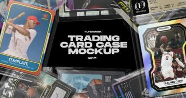
The Sports & Trading Card Case Mockup psd is a great way to showcase your designs in the sports card industry. This mockup includes a simple, yet effective design that will help you create professional-looking cards with ease. The included PSD file contains all of the elements needed for you to start creating your own… Read More »